Technology
In today’s digital landscape, mobile devices have become an integral part of our lives. From smartphones to tablets, people rely on these devices to access information, shop, and connect with others. As a result, it has become crucial for businesses and website owners to prioritize responsive design to cater to the needs of this mobile-first world. In this article, we will explore the importance of responsive design and how it helps in creating websites that seamlessly adapt to different screen sizes and devices.
The Rise of Mobile Devices:
Over the past decade, mobile device usage has skyrocketed. Smartphones have become an extension of our identities, and we depend on them for instant access to information. According to Statista, mobile devices accounted for more than half of the global website traffic in 2021. This shift in user behavior emphasizes the need for websites that provide optimal user experiences across various screen sizes.
Enhanced User Experience:
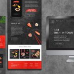
Responsive design plays a vital role in ensuring an enhanced user experience. When a website is designed responsively, it automatically adjusts its layout, content, and functionality to fit different screen resolutions. This means that users can easily navigate and interact with the website, regardless of the device they are using. Whether it’s a large desktop monitor or a small smartphone screen, responsive design ensures that the website remains user-friendly and visually appealing.
Improved SEO Performance:
Search engine optimization (SEO) is another crucial aspect of website development. Responsive design positively impacts SEO performance by providing a consistent user experience across all devices. Google, the most popular search engine, recommends responsive design as a best practice. Having a responsive website improves search engine rankings, as Google prioritizes mobile-friendly websites in search results. A higher ranking leads to increased visibility, organic traffic, and potential business growth.
Cost-Effective Solution:
In the past, companies had to make two websites, but now responsive design helps businesses save money by keeping one site for all devices. If you want a cost-effective, single website solution, a Web Design Company in Bangladesh can build it for you. Managing and updating a single website is far more efficient than managing multiple versions. Additionally, responsive design future-proofs your website by ensuring it can adapt to new devices and screen sizes as they emerge.
Consistent Branding and Messaging:
Maintaining consistent branding and messaging across all devices is crucial for building trust and recognition. Responsive design allows businesses to present a unified brand experience, regardless of the device used to access the website. Consistent visual elements, such as logos, colors, and typography, reinforce brand identity and make it easier for users to connect with your business.
Conclusion:
In a mobile-first world, responsive design has become an indispensable part of website development. It ensures that websites provide seamless experiences across various devices, improves SEO performance, reduces development and maintenance costs, and maintains consistent branding. With the increasing reliance on mobile devices, businesses and website owners must prioritize responsive design to meet the evolving needs and expectations of their users. By embracing responsive design, businesses can unlock new opportunities, reach a wider audience, and stay ahead in an ever-changing digital landscape.